
Instagram Ad Specs: 2026 Format Guide
Master Instagram ad specs for 2026. Get exact image, video, and text dimensions for Feed, Stories, and Reels, plus safe area rules to prevent UI overlap.
instagram ad specs, instagram ad sizes, meta ad formats, reels ad dimensions, social media specs
The most popular advice about Instagram ad specs is also the least useful: upload the recommended pixel dimensions and you’re done. A file can satisfy Meta’s technical checks and still hide the offer under interface controls, lose the logo to an automatic crop, or leave subtitles unreadable on a smaller screen.
Good production starts by separating eligibility from delivery quality. Pixel dimensions, aspect ratio, duration, and file size determine whether an asset can pass the upload process. Placement-native composition determines whether people can understand it after Instagram adds profile information, captions, reactions, and calls to action. The practical question isn’t only, “What can I upload?” It’s, “What will still be visible when the ad is rendered?”
Table of Contents
- Why Minimum Dimensions Are Not Enough
- Instagram Feed Ad Specifications
- Stories and Reels Safe Zones
- Video Length and File Constraints
- Text Limits and Caption Truncation
- Placement Economics and Performance
- Automating Spec Validation with AdCrunch
- Quick Reference and Cross-Links
Why Minimum Dimensions Are Not Enough
Meta’s official Instagram media requirements recommend a 1:1 aspect ratio for image and video ads in the Instagram stream, with every image and video at least 600 pixels wide. Those are important gates, but they’re not a design brief. A square asset may be accepted perfectly while still being a weak choice for a particular message, audience, or placement.
The same distinction applies to vertical creative. Stories and Reels are authored for a full-screen 9:16 canvas, with Meta recommending 1080×1920 px and documenting a minimum vertical resolution of 600×1067 px in its Stories guidance. A 1080×1920 file can be technically sound and still fail commercially if the headline sits behind the profile header or the call to action lands beneath the lower controls.
Compliance and visibility are separate checks
I treat every asset as having two test layers:
- Technical eligibility: aspect ratio, minimum width, extension, duration, file size, and thumbnail consistency.
- Rendered usability: legibility, safe placement, crop resilience, subtitle visibility, and clarity of the next action.
Images may be cropped under the cited media requirements, while videos cannot be cropped in the same way. That difference matters when teams reuse a master file across placements. A feed image might survive a crop because the subject sits centrally. A video with edge-positioned text may become awkward or unreadable when adapted.
Practical rule: Don’t approve an ad because the upload validator accepts it. Approve it only after the placement preview shows that the message survives the interface.
The production workflow should therefore create a supported ratio first, then place essential content inside a deliberate central area. Test the result with subtitles, longer translated copy, and the actual platform controls visible. If your team can’t produce separate versions, use the safest master composition and accept that technical compatibility is a compromise, not optimization.
Instagram Feed Ad Specifications
Feed specs look straightforward until the asset hits a real device. A file can meet the minimum width requirement and still lose readability because the crop feels tight, the thumbnail picks the wrong frame, or the caption pushes attention away from the visual. For Feed, dimensions are the starting point. Composition discipline is what keeps the ad usable after upload.
Meta supports square and portrait Feed formats, and every image or video must be at least 600 pixels wide. Square, 1:1, remains the safest baseline for brands that need one dependable format across many accounts. It is easy to template, easy to version for carousels, and less likely to create awkward reframing when the source creative was not shot vertically.
Portrait, 4:5, deserves separate production rather than a lazy crop of the square master. The extra height gives the product, person, or offer more visual presence in the scroll. Analysts often cite stronger impression potential for taller Feed creative, including examples collected in Webtonic’s Instagram ad examples, but the result is still conditional. Objective, auction pressure, creative quality, and audience all affect whether that extra canvas improves delivery.
Build for the rendered Feed, not the export file
I use this order when approving Feed assets:
- Choose the ratio around the subject. Use 1:1 when the frame is naturally centered or graphic-led. Use 4:5 when added height improves product visibility or gives headline and image more breathing room.
- Build at production size, not minimum size. A square Feed asset should be designed at 1080×1080 px. A portrait version should be designed at 1080×1350 px.
- Set internal safe margins before design starts. Keep logos, price points, and short headlines away from the outer edges so minor crop behavior and device rendering do not make them feel cramped.
- Keep carousel cards uniform. Every card should share the same ratio. Mixed dimensions create inconsistent framing and make the sequence look patched together.
| Format | Aspect Ratio | Recommended Resolution | Max File Size |
|---|---|---|---|
| Feed image, square | 1:1 | 1080×1080 px | 30 MB |
| Feed image, portrait | 4:5 | 1080×1350 px | 30 MB |
| Feed video | 1:1 or placement-supported ratio | At least 600 px wide | 2.3 GB under the cited media requirements |
Feed images may be cropped, so check borders, product cutoffs, and text spacing in preview, not only in the design file. Feed video needs a second check. The opening frame, cover selection, and subtitle placement all shape whether the ad still reads cleanly in the first second.
Creative teams also waste time by forcing one master file across every Feed variation. A square version is reliable. A portrait version often wins the stop-scroll test when the story benefits from more height. Test them as separate assets, and if you need soundtrack ideas for a montage or mood-led cut, you can browse LesFM moods before final edit approval.
Stories and Reels Safe Zones
Stories and Reels need a genuine full-screen vertical asset, not a Feed export stretched into a taller frame. Meta recommends 9:16 and 1080×1920 px for Stories, while its documented minimum is 600×1067 px. JPG and PNG images can be up to 30 MB, and MP4 or MOV video can be up to 4 GB under the cited Stories guidance.
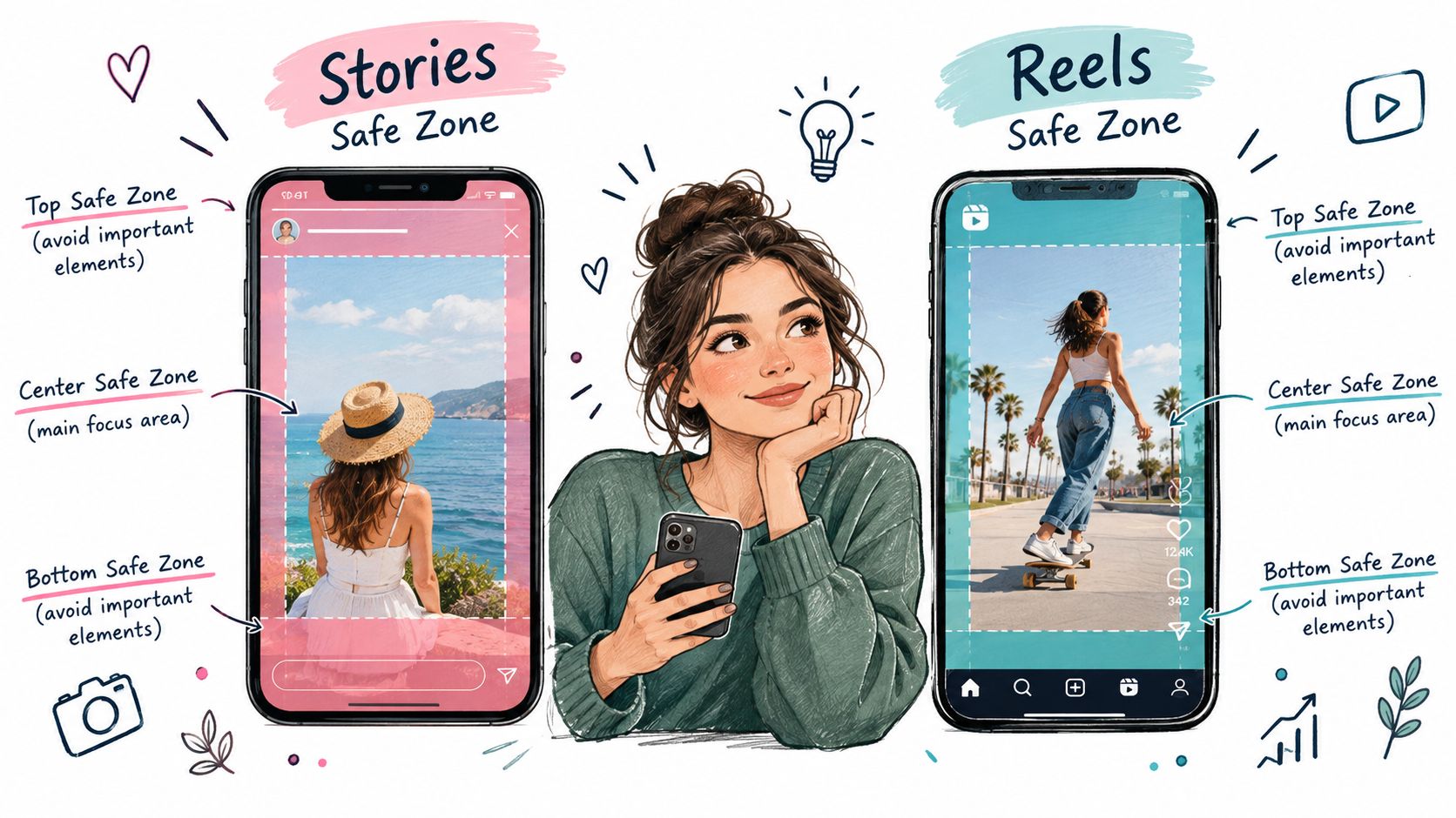
The ratio is the easy part. The difficult part is UI occlusion. The top of the canvas can carry profile information, while the lower area can contain captions, reactions, navigation, or the response control. Reels adds its own engagement and audio interface. A logo positioned near an edge may be visible in a design file and functionally invisible in delivery.
Use percentages, not one fixed pixel recipe
A fixed safe-area measurement can become fragile when screens, controls, and translated copy change. I use a percentage-based layout rule instead:
- Top buffer: Keep essential text and logos out of roughly the upper 15% of the canvas.
- Bottom buffer: Keep critical information out of roughly the lower 20% to 25%.
- Central message zone: Place the offer, product identifier, subtitle block, and primary action in the remaining middle area.
- Edge tolerance: Let backgrounds and nonessential decoration occupy the outer regions, but don’t place meaning there.
Those proportions are a production framework, not a guarantee that every account or language will display identical controls. Preview the creative with the platform UI and test longer words. Localization can expand a short English headline enough to push the final line into an unsafe area.
For teams adapting a master asset, StreamGen’s aspect ratio guide is useful for understanding the mechanics of reframing, but automatic reframing isn’t a substitute for redesign. A crop can preserve the subject while removing the context that makes the ad persuasive.
Test the message, not just the frame
Run four checks before approval:
- Subtitle check: Can every line be read without sound, including the final line?
- Logo check: Does the logo remain recognizable when the interface appears?
- Action check: Is the benefit and next action visible without relying on the caption?
- Localization check: Does the layout survive text expansion and different line breaks?
If your workflow also distributes assets across Facebook and Instagram, keep the placement logic explicit rather than trusting one automatic crop. The guide to posting on both Facebook and Instagram is a useful operational reference, but the creative still needs separate vertical and Feed renditions when the layouts have different jobs.
Video Length and File Constraints
Video rejection usually comes from a small set of predictable failures. The file has the wrong extension, exceeds the allowed size, falls outside the permitted duration, or arrives with an API thumbnail that doesn’t match the video. A preflight checklist catches these problems before an editor has to re-encode a finished asset.
Under Meta’s cited Instagram media requirements, video ads must run between 3 and 60 seconds, and video uploads can’t exceed 2.3 GB. For video ads created through the API, the required thumbnail must match the video’s aspect ratio and be at least 600 pixels wide. Those constraints are production rules, not suggestions for the creative team.
Separate the upload gate from the creative decision
A technically accepted length isn’t automatically a sensible length. A longer explanation may suit a Feed placement, while a fast vertical unit needs the opening visual and value proposition to work immediately. Avoid choosing duration solely because the platform permits it.
Use this handoff checklist:
- Container: Export in a format supported by the target workflow, commonly MP4 or MOV.
- Ratio: Render the placement-native version instead of relying on a post-upload crop.
- Duration: Check the actual encoded runtime, not the intended edit length.
- File size: Validate the final file after encoding, because a master export can change materially after audio, captions, or bitrate adjustments.
- Thumbnail: For API workflows, confirm the thumbnail ratio matches the video and that its width meets the documented minimum.
- First frame: Make sure the opening frame doesn’t depend on a later cut to explain the product.
Avoid the re-encoding loop
The most efficient process validates the final deliverable, not the project file. A video can look correct in an editor and fail after export because the encoder changes duration metadata, dimensions, or file size. Store the accepted asset alongside its ratio and placement metadata, then prevent later edits from replacing it with an unvalidated version without detection.
Audio and subtitles also need a delivery review. Captions should remain inside the central visual area, and the ad should communicate its basic promise without requiring the viewer to turn sound on. That makes the file more resilient across Feed, Stories, and Reels without pretending that one cut is equally native everywhere.
Text Limits and Caption Truncation
Caption limits rarely cause the problem. The issue is that people judge the ad from the collapsed view, while teams often write for the expanded one.
Primary text can run long, but only the opening portion is likely to show before someone taps for more in common Feed views. Treat those first lines as the ad, not as a lead-in to the ad. If the hook, offer, or product context shows up later, the upload may pass and the message still underperform.
Write for the collapsed state
Build the caption in a strict order:
- Audience or problem: Identify who this matters to, or name the pain point immediately.
- Specific benefit: State the outcome in plain language.
- Proof or qualifier: Add the detail that makes the claim credible.
- Next action: Tell the viewer what to do next.
This is less about copy style and more about survivability in the interface. A long caption can still carry nuance, objections, and supporting detail for people who expand it. The opening has a different job. It has to stand on its own, because many impressions never get past the collapsed state.
On-canvas text is a separate constraint. A well-written caption does nothing for a subtitle or promo line that sits under Reels controls or too close to the lower edge in Stories. Keep visual copy short enough to stay clear of interface overlap, and review line breaks in every placement you plan to buy.
Treat localization as a layout test
Localization breaks more ads than copy teams expect. English often fits in one clean line. The approved translation can turn that line into two or three, push the final word into a control area, or force a font-size reduction that weakens legibility.
The fix is operational. Set maximum line counts, use flexible text containers, and validate the longest approved version before export. If your workflow is automated, add rules for character count, line count, and text-box height so a localized variant cannot replace an approved asset without another check.
The cleanest split is between caption copy and on-canvas copy. Use the caption for context, qualification, and added detail. Use the creative for the promise, the brand, and the action, because those elements still need to read clearly when the caption is truncated or visually secondary.
Placement Economics and Performance
A compliant file can still be an expensive ad. Placement performance usually breaks on three operational points: how much of the message survives the interface, whether the format matches the user’s viewing behavior, and whether the auction rewards that placement for your objective.
Feed, Stories, and Reels do not earn budget just because the same asset uploads everywhere. In practice, cost differences between placements are common, but they are not stable enough to use as a forecast for any single account. Treat placement economics as something you verify with controlled tests, not as a fixed rule.
Compare formats by objective
Feed usually gives you more room for product framing, copy support, and carousel sequencing. Stories and Reels give you a full-screen canvas and stronger visual focus, but they punish slow openings and weak safe-zone discipline much faster. The right choice depends on the action you need from the impression.
| Decision | Feed-native version | Vertical version |
|---|---|---|
| Primary strength | Product detail and scroll interruption | Full-screen attention and motion |
| Main risk | A smaller visual footprint when the design is too short | Occluded text or controls covering the action |
| Best production choice | Square or portrait layout chosen around the visual | True 9:16 composition with central safe placement |
| Measurement need | Compare ratio and creative concept separately | Compare vertical cut, hook, and placement separately |
Teams waste money here. They look at a blended result, see that one asset drove cheaper clicks, and call the format a winner. That reading is too loose. A cheaper result may come from placement, audience mix, hook speed, offer clarity, or edit quality. If the test is meant to answer a placement question, keep the variables tight enough that the answer means something.
I usually approve native variants in two cases. First, the placement already has enough delivery to matter. Second, the message includes edge-sensitive elements such as subtitles, offer text, product UI, or a call to action that can be clipped, compressed, or visually weakened by reuse. A shared master only makes sense when the composition is deliberately crop-resilient and the placement preview confirms that the selling point stays visible.
That trade-off matters just as much when you are promoting Instagram posts as when you are building larger campaign structures. Pay for another rendition when it protects comprehension or improves measurement. Do not pay for one just to satisfy a ratio checklist.
Automating Spec Validation with AdCrunch
Manual validation breaks down when one team manages multiple accounts, markets, and placement variants. A person may check the original export, then miss that a translated version has a different ratio, a new thumbnail, or a larger file. The safest workflow turns the rules into gates that run before campaign creation.
AdCrunch can encode Meta’s constraints into the creative workflow. It can reject unsupported extensions, flag dimensions below the recommended quality threshold, check image and video file sizes, validate duration, and require a 9:16 rendition before a vertical placement is enabled. It can also support a review path for files that technically qualify but need a quality decision.
Build the validator around failure modes
A useful rule set should inspect more than filename and extension:
- File identity: Confirm the asset belongs to the intended brand, campaign, market, and placement.
- Media type: Reject unsupported extensions before the asset reaches Ads Manager.
- Dimensions: Flag files below the required minimum and route borderline quality cases to review.
- Ratio: Require a placement-compatible rendition instead of automatic cropping.
- Duration and size: Stop files that exceed the documented limits.
- Thumbnail consistency: For API-created video ads, confirm ratio matching and minimum thumbnail width.
- Safe-area review: Use a template overlay or computer-vision check to flag important content near the top and bottom of vertical frames.
- Preview evidence: Save the rendered preview with the approval record.
The validator shouldn’t treat every warning as a hard failure. An unsupported extension is a clear rejection. A portrait Feed asset may be an intentional choice that needs review rather than automatic blocking. Separate must fix, review, and approved states so the team can move quickly without weakening control.
Preserve an audit trail
Store the validation result, rule version, reviewer, and final asset reference. That record matters when a client asks why a campaign used one ratio, when a localized version changes, or when Meta updates a requirement. The Meta Ads automation guide offers broader operational context for connecting validation with campaign workflows.
The goal isn’t to remove human judgment. It is to reserve judgment for creative and commercial decisions, while software catches the predictable technical mistakes that cause rejected uploads and clipped ads.
Quick Reference and Cross-Links
Keep this matrix beside the export queue, but don’t use it as a substitute for previewing the live composition. The minimum resolution and maximum runtime are eligibility markers. They don’t tell you whether a subtitle sits beneath a control or whether a portrait crop removes the product.
| Placement | Aspect Ratio | Min Resolution | Max Video Length |
|---|---|---|---|
| Instagram Feed stream | 1:1 recommended | 600 px wide | 60 seconds under cited media requirements |
| Stories | 9:16 recommended | 600×1067 px documented minimum | 60 seconds under cited Stories guidance |
| Reels | 9:16 | 600 px wide under cited media requirements | Validate against the current placement workflow |
| API-created video ad | Match target video ratio | Thumbnail at least 600 px wide | 60 seconds under cited media requirements |
Use the matrix as a launch checklist
Before an asset moves to trafficking, confirm:
- Placement assignment: The file has a defined destination instead of “all placements.”
- Ratio check: The canvas matches that destination or has an explicit review exception.
- Resolution check: The file meets the relevant minimum and the visual remains sharp after compression.
- Runtime check: The encoded duration falls within the applicable rule.
- Size check: The final export, not the editing master, is within the upload limit.
- Safe-area check: Logos, subtitles, offers, and calls to action sit in the central vertical region.
- Preview check: The ad has been reviewed with interface controls visible.
- Copy check: The opening caption communicates the offer before truncation.
Teams that schedule and coordinate many organic and paid assets may also find a Social Media Scheduler for Instagram useful for planning the surrounding publishing workflow. Scheduling doesn’t validate paid creative, though. Keep trafficking approval, placement routing, and safe-zone review as separate operational steps.
The most reliable Instagram ad specs workflow is deliberately repetitive: export placement-native files, validate them automatically, preview them with UI overlays, then measure each placement on its own terms. That process prevents a technically valid asset from becoming an expensive visibility problem.
AdCrunch helps multi-account teams validate creative inputs, build and manage Meta campaigns, and keep every operational change in a permanent activity log. Visit AdCrunch to connect your ad workflow with controlled automation before your next Instagram launch.